Thursday, 2 May 2013

Receiving the book


After panicking thinking the book wasn't going to be printed in time, it was sent to me with six days to spare. Once I receive the book, i was extremely nervous, the hard work that I had put in for the last 4 months was a finished product. I had decided on a light grey cover that fades into white. I chose this as I wanted it to be simple, and didn't want to reveal to much of what was inside. The book was a lot thicker than i thought but this added to the sheer size of it, it felt like a bible of my work. Unfortunately I was disappointed when looking through some of the pages, I noticed a few of the images looked as though they were slightly clouded, I cannot understand what this is. The other thing i noticed was the colours were not as bright as I had hoped, particularly the poppy shoot and the cowardly lion, I used a white foundation on the models face for this shoot which looked perfect on the screen but as this printed out darker i noticed a few flaws, the application didn't look as smooth as I had hoped. After speaking to my tutor he explained this is because computers had a back light making the images seem brighter. After speaking to my peers, they explained they couldn't see anything wrong with the images. I think this is because I know the vibrancy of the colours of each photo that I could tell this was not right. However there was nothing I could do to resolve this issue, a test print with the company could have prevented this happening, but unfortunately due to time and money this was not possible.
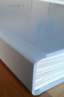


I feel my time management should have been planned better but I didn't realise how much work I had set myself when choosing to do an A3 book as each image had to be edited to the best of my ability due to the size, every flaw of the makeup and skin would have been noticed. Looking back at the images I still have noticed a few flaws but I just did not have the time to check every image was edited perfectly. I now have a new found respect for retouchers. 
Overall I am extremely happy with the book. The size of it really has a huge impact when looking through it. I feel the different text sizes and fonts really add to the book. I feel I have learnt a lot through the journey of this book, and feel I have gained a lot of confidence when collaborating with others.


Monday, 29 April 2013

Software Complication

The printers that I am using requires me to layout my design on there software, I have downloaded this to a university computer as my own is very temperamental. I have been using the software and testing out different things to see what can be done on it and make sure it is suitable for what I am after.
Unfortunately the software for this sight doesn't allow me to use the desired texts I want, so I therefore have to create the desired text in photoshop placed on the desire image and then upload this. This was done for all my photos. They were tuned into Jpegs as this is what was required.
Once all my photos were completed I uploaded them to the sight and placed them were they were needed. However when trying to send it off the computer wouldn't connect to the server and after speaking to an I.t technician he said this was down to the university's Internet and wouldn't let it be sent out. I spoke to the printers about the problem and she suggested burning it to a disc and sending it in the post, however the book needs to be back to me by Friday ad it is currently Monday, I was unaware of the problem with the university's Internet and I suggested going to a friends and doing it there and the lady I spoke to said this would be the best idea. It entailed me relaying the whole book out again but at least this would ensure I would get the book back in time.

Sunday, 28 April 2013

Contributors Layout

I looked through Alex Box's book to gain inspiration as to how to layout the contirbutors page.
I love the layout and sizes of these pages. The range of sizes of the images still keep the reader interested.


Fonts used

I referred back to Graham Rawles interpretation of the Wizard of Oz, and recreate the idea of using a number of different fonts and font sizes, this was then varied further through the use of Italics and changing the boldness. Altogether I counted around 7 or 8 fonts throughout the whole book, I used about the same for mine.  Though this was time consuming changing all the different fonts it was definitely worth it for the end result. Th variation of text makes it so much more interesting to look at. The pages of just text have been transformed by using these texts.

Text and Page layout

From conversations with my tutor she suggested looking for examples of different ways to display text in the book. A number of photos were taken from layouts that interest me.
The use of the bold text across a double page is quite bold and makes a statement.

I looked at how images were placed at the different ways text could be placed over images.


I feel like the idea how the text in these images is quite small and subtle, the image is still the main focus of the page.


I particularly think the layout and font sizing here is rather effective. This could sit well within my book, and will be considered when I come to lay out my text.


I plan to have a few pages of just text. The first quote after the introduction will help introduce the story, the next will be the quote to match with the poppy scene. Two pages will have quotes as well as snippets from the story to help move it along. 


I have played around with laying out my images in Indesign so I can see how the pages will look together. I referred back to the research I have found to help with laying out the images.
I have chosen a number of quotes from the books which help support the photos and move the story along.


Friday, 26 April 2013

Reflection and editing- Wizard lady

When looking through the images of the Wizard Lady I thought it wasn't looking hopeful, the models face did not seem structured enough for this look. However I have slightly edited her face to give it some more structure. The colour of the green was also deepend. From speaking with my tutor she said to make this more editorial and play around with the hair. I decided to play around with adding black into the hair.


Next the background was darkened, a shade of green from the eyeshadow was used, I felt this totally changed the mood of the image which worked well with the story line.

This shoot could have been improved if I used a different wig, as previously spoken about in another blog post, I would have preferred a curly one with no fringe. Again as I mentioned I would have used a different model.


The final images of this shoot will be found in the book. 

Reflection and editing- Poppies

Once looking through the images of the poppies I felt the red neck looked really strong. Below are the paintings of the poppies, and then the edited poppies on photoshop I have spoken about in a previous post. 


 I edited the poppies so they came through the lips of the natural makeup, and felt this wasnt strong enough, so I tried with the red neck and felt this made a really effective image.


My tutor had suggested to just have the lips cut out on the page as shown below, this then had the poppies coming through them. I felt as though this wasnt a strong enough image. So I carried on with my next idea of the poppies on the neck.

As you can see from the image below the red hair spray worked really well, the coverage is very even and smooth. 
I initially started editing the poppies just on the neck and then later adapted this so it was on the lips aswell. It worked better with it on the lips and neck so this will be a final image of mine.


To improve this shoot I would have painted the poppies on the skin, but due to time this was not possible, however I feel it has worked really well and is rather effective this way.


The final images of this shoot will be found in the book.